A "Timeframe" simply defines how much time each candlestick represents. It's a compression setting for price data.
- On a Monthly (MN) chart, one candle = 1 month of trading activity.
- On a Daily (D1) chart, one candle = 1 day of trading.
- On a 1-Hour (H1) chart, one candle = 1 hour of trading.
- On a 1-Minute (M1) chart, one candle = 60 seconds of trading.
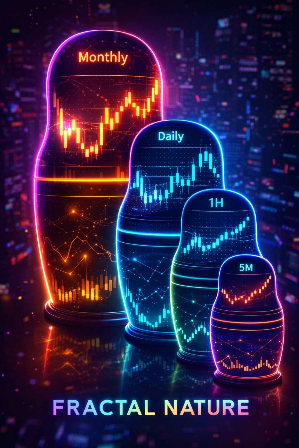
This means inside every Daily candle, there are 24 H1 candles (for 24-hour markets like Forex). Inside every H1 candle, there are 60 M1 candles. And inside every M1 candle, there are 60 individual seconds of price ticks. This nesting doll structure—where patterns within patterns within patterns exist at every scale—is called a Fractal.
Understanding fractals is crucial because the same concepts (trends, support, resistance, breakouts) apply on every timeframe. A breakout on the 5-minute chart looks identical to a breakout on the Weekly chart—only the scale and significance differ.
1. The Google Earth Analogy
Imagine using Google Earth.
- Monthly/Weekly (Satellite View): You see continents and oceans. You see the major trend. You know if you are in a desert or a forest.
- H4/H1 (Helicopter View): You see cities and highways. You can see traffic jams (consolidations) and open roads (trends).
- M5/M1 (Street View): You see individual cars and potholes. It's chaotic. It's fast.
The Mistake: Most beginners spend all day in "Street View" (M1/M5) and wonder why they get run over by a truck they didn't see coming. They forgot to check the Satellite View.
2. Which Timeframe is "Best"?
There is no best timeframe. There is only the timeframe that fits your lifestyle.
The Scalper
M1 to M15.
Needs fast action. Glued to the screen. High stress, quick feedback.
The Day Trader
M15 to H1.
Captures the daily move. Closes positions before sleep. Balanced pace.
The Swing Trader
H4 to Weekly.
Checks charts once a day. Captures big moves. Low stress. Ideal for people with jobs.
3. The Noise Factor
Rule: The lower the timeframe, the higher the noise-to-signal ratio.
On a 1-minute chart, a random buy order from a bored billionaire, a fat-finger error from a junior trader, or an algorithm testing liquidity can create a massive green candle that looks exactly like a breakout signal. Thousands of traders might enter based on that "signal"—and then watch it immediately reverse as the noise dissipates.
On the 4-Hour or Daily chart, that same random order is completely invisible. It gets absorbed into the broader price action like a drop of water in an ocean. What remains on higher timeframes is the genuine supply and demand imbalance—the real "signal" that actually matters.
Trading higher timeframes is generally easier because technical levels (support, resistance, trendlines) are respected more cleanly. More participants are watching those levels, creating self-fulfilling prophecies. On lower timeframes, algorithms and high-frequency traders dominate, making it much harder for retail traders to compete.
Summary
Timeframes are filters—different lenses through which you view the same underlying market. They determine how much data you see, how much noise you filter, and what kind of moves you can realistically capture.
Don't get stuck on one view. A good trader knows when to zoom out for context (understanding the bigger picture, identifying major levels) and when to zoom in for execution (finding precise entries, managing risk tightly). The timeframe you choose should match your lifestyle, your psychology, and your risk tolerance—not what some guru told you was "the best."
But here's the key insight: timeframes don't exist in isolation. What looks like a pullback on the Daily chart is an entire trend on the 15-minute chart. Learning to see how different timeframes relate to each other—this is where real trading skill begins to develop.