If you walked into a hospital emergency room and looked at an ECG (Heart Monitor), it would just look like random squiggly lines to you. But to a doctor, those lines tell a vivid story of life, death, stress, and recovery. They can spot a heart attack before it happens just by seeing a slight deviation in the pattern.
A price chart is exactly the same thing. It is the ECG of the Market.
Every tick up is greed. Every tick down is fear. The chart captures the collective decision-making of millions of participants—from the kid trading $50 in his basement to the Goldman Sachs algorithm moving $500 million. It tells you exactly what buyers and sellers agreed upon at any given nanosecond. It is the only "Source of Truth" in trading. News lies, CEOs lie, analysts lie, government data is revised... but Price never lies. Price is the receipt.
1. The Two Dimensions: Time & Price
Every 2D chart is defined by two axes. This might sound like basic geometry, but understanding the relationship between these two forces is what separates amateurs from pros.
The Y-Axis (Vertical): Price (Value)
This is what everyone focuses on. It represents the current exchange rate. It is the "Score" of the game. When the line goes up, buyers are aggressive and willing to pay higher prices. When it goes down, sellers are aggressive and willing to accept lower prices.
The X-Axis (Horizontal): Time (Duration)
This is the dimension most beginners ignore. Time is the constraint we fight against. A move that happens in 10 minutes is very different from a move that takes 10 months.
Example: If Bitcoin goes from $20k to $30k in one day, that is euphoria (unsustainable). If it does it over 6 months, that is healthy growth (sustainable). Analyzing Price without analyzing Time is like trying to calculate speed without knowing the distance.
2. Types of Charts: Choosing Your Weapon
There are three main ways to visualize price data. Each has a specific purpose, and professional traders often switch between them depending on what they are looking for.
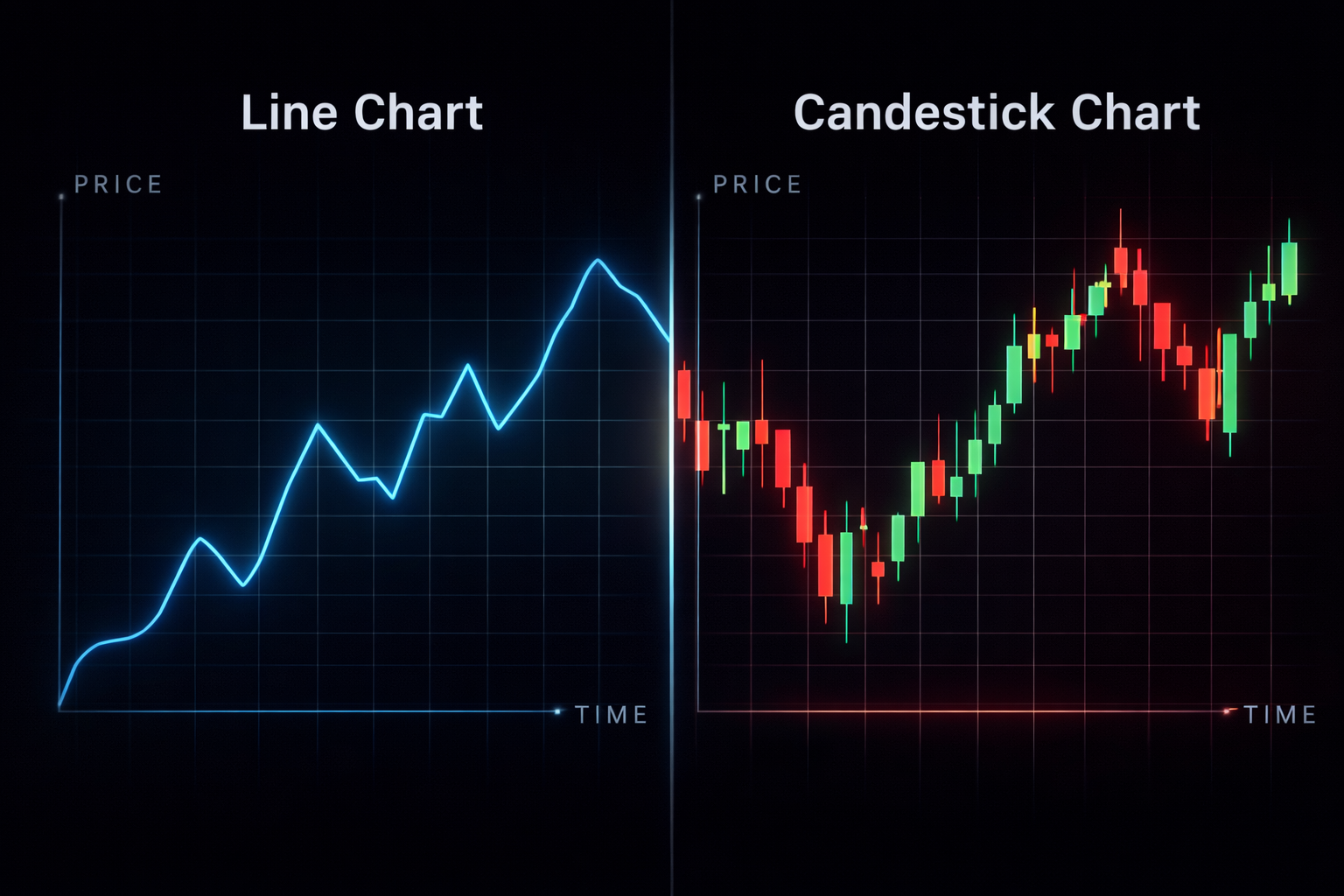
Line Chart
A simple line connecting only the Closing Prices.
Why use it? It removes the "noise." When you want to see the pure trend without getting distracted by wicks and volatility, the Line Chart is perfect. It is great for identifying major Support and Resistance levels on higher timeframes.
Bar Chart (OHLC)
Vertical lines with horizontal tabs on the left (Open) and right (Close).
Why use it? It shows the full range of volatility (High and Low) like candles, but without the colored "bodies." Some classic Western traders prefer this because it is cleaner and less emotional than big red/green blocks.
Japanese Candlesticks
The industry standard. Uses colored "Bodies" to show the Open/Close range and "Wicks" for High/Low.
Why use it? It is the most information-dense visualization. It instantly tells you who won the battle (Bulls or Bears) and with how much conviction. We will focus exclusively on this.
3. Logarithmic vs. Linear Scale: The Hidden Trap
This is a setting often hidden in the bottom corner of your charting software (TradingView), but getting it wrong can completely ruin your long-term analysis, especially in Crypto.
Linear Scale (Arithmetic)
On a linear chart, the vertical distance between price points is absolute. The distance from $10 to $20 is visually the same as $100 to $110.
- The Problem: A move from $10 to $20 is a 100% gain. A move from $100 to $110 is only a 10% gain. Yet they look identical.
- Use Case: Day Trading, Forex (where prices move in small percentages), or short-term scalping.
Logarithmic Scale (Log)
On a log chart, the vertical distance represents Percentage Change. The distance from $10 to $20 (+100%) will look visually the same as the distance from $1,000 to $2,000 (+100%).
- The Benefit: It allows you to analyze exponential growth assets (like Bitcoin or Tech Stocks) over long periods. If you look at a Bitcoin chart from 2010 to today on Linear, the early years look like a flat line. On Log, you see the true market cycles.
- Use Case: Long-term investing, Crypto, Trend Analysis on weekly/monthly timeframes.
Rule of Thumb: If the asset price has doubled or tripled on your screen, switch to Log view. Otherwise, your trendlines will be mathematically incorrect.
4. Price vs. Indicators
When new traders discover charts, they often go through a "Picasso Phase." They add the RSI, the MACD, three Moving Averages, Bollinger Bands, and the Ichimoku Cloud. The actual price bars become barely visible behind a mess of colorful lines.
You must understand this fundamental truth: Indicators are derivatives of Price. They are simply mathematical formulas applied to past price data.
- Price is the driver.
- Indicators are the speedometer.
If you are driving a car, can you drive by only looking at the speedometer? No. You will crash. You must look through the windshield (Price Action). The speedometer is just a lagging confirmation of what your eyes already see.
A "Divergence" on the RSI is useless if Price Structure is screaming "Continuation." Learn to read the naked chart first. Add indicators later, only as subtle confirmations.
Summary
The chart is your workspace. It is your map. It is the battlefield where you will make all your decisions. Treat it with respect. Keep it clean. Don't clutter it with noise—every unnecessary indicator is a potential source of confusion and hesitation.
Your goal is to see the interaction between buyers and sellers as clearly as possible. The chart shows you where they agreed on price, where they fought, where one side capitulated. At The Traders' Light, we focus on Japanese Candlesticks because they are the most powerful language for reading this interaction—each candle tells you not just where price went, but how it got there and who won the battle.